How TO - Build a Website
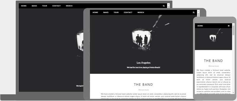
Learn how to create a fast and awesome responsive website that will work on all devices, PC, laptop, tablet, and phone.
Create a Website with a CSS Framework
DID YOU KNOW?
There is a Crash Course for building the above web site.
A "Layout Draft"
It is always wise to draw a layout draft of the page design before building a website.
Having a "Layout Draft" will make it a lot easier to create a web site:
Navigation bar
The Band
Description of the band
Description of the band
Description of the band
Article
Article
Article
Footer
Doctype, Meta Tags, and CSS
The doctype should define the page as an HTML5 document:
<!DOCTYPE html>
A meta tag should define the character set to be UTF-8:
<meta charset="UTF-8">
A viewport meta tag should make the web site work on all devices and screen resolutions:
<meta name="viewport" content="width=device-width, initial-scale=1">
W3.CSS should take care of all our styling needs and all device and browser differences:
<link rel="stylesheet" href="https://www.w3schools.com/w3css/3/w3.css">
To learn more about styling with W3.CSS, please visit our W3.CSS Tutorial.
Our first empty web page will look much like this:
<!DOCTYPE html>
<html>
<meta charset="UTF-8">
<meta name="viewport"
content="width=device-width, initial-scale=1">
<link rel="stylesheet"
href="https://www.w3schools.com/w3css/3/w3.css">
<body>
<!-- Content will
go here -->
</body>
</html>
Note: If you want to create a website from scratch, without the help of a CSS framework, read our How To Make a Website Tutorial.
Creating Page Content
Inside the <body> element of our web site we will use our "Layout Picture" and create:
- A navigation bar
- A slide show
- A header
- Some sections and articles
- A footer
Semantic Elements
HTML5 introduced several new semantic elements. Semantic elements are important to use because they define the structure of web pages and helps screen readers and search engines to read the page correctly.
These are some of the most common semantic HTML elements:
The <section> element can be used to define a part of a website with related content.
The <article> element can be used to define an individual piece of content.
The <header> element can be used to define a header (in a document, a section, or an article).
The <footer> element can be used to define a footer (in a document, a section, or an article).
The <nav> element can be used to define a container of navigation links.
In this tutorial we will use semantic elements.
However, it is up to you if you want to use <div> elements instead.
The Navigation Bar
On our "Layout Draft" we have a "Navigation bar".
<!-- Navigation -->
<nav class="w3-bar w3-black">
<a href="#home"
class="w3-button w3-bar-item">Home</a>
<a href="#band"
class="w3-button w3-bar-item">Band</a>
<a href="#tour"
class="w3-button w3-bar-item">Tour</a>
<a href="#contact"
class="w3-button w3-bar-item">Contact</a>
</nav>
We can use a <nav> or <div> element as a container for the navigation links.
The w3-bar class is a container for navigation links.
The w3-black class defines the color of the navigation bar.
The w3-bar-item and w3-button class styles the navigation links inside the bar.
Slide Show
On the "Layout Draft" we have a "Slide show".
For the slide show we can use a <section> or <div> element as a picture container:
<!-- Slide Show -->
<section>
<img class="mySlides" src="img_la.jpg"
style="width:100%">
<img class="mySlides" src="img_ny.jpg"
style="width:100%">
<img class="mySlides" src="img_chicago.jpg"
style="width:100%">
</section>
We need to add a little JavaScript to change the images every 3 seconds:
// Automatic Slideshow - change image every 3 seconds
var myIndex = 0;
carousel();
function carousel() {
var i;
var x = document.getElementsByClassName("mySlides");
for (i = 0; i < x.length; i++) {
x[i].style.display = "none";
}
myIndex++;
if (myIndex > x.length) {myIndex = 1}
x[myIndex-1].style.display = "block";
setTimeout(carousel,
3000);
}
Sections and Articles
Looking at the "Layout Draft" we can see that the next step is to create articles.
First we will create a <section> or <div> element containing band information:
<section class="w3-container w3-center"
style="max-width:600px">
<h2 class="w3-wide">THE
BAND</h2>
<p class="w3-opacity"><i>We love music</i></p>
</section>
The w3-container class takes care of standard padding.
The w3-center class centers the content.
The w3-wide class provides a wider heading.
The w3-opacity class provides text transparency.
The max-width style sets a maximum with of the band description section.
Then we will add a paragraph describing the band:
<section class="w3-container w3-content w3-center"
style="max-width:600px">
<p class="w3-justify">
We have created a fictional band website. Lorem ipsum dolor sit amet, consectetur adipiscing elit, sed do eiusmod tempor incididunt ut labore et dolore magna aliqua.</p>
</section>
The w3-justify class justifies the text's right and left margins.
Then create a <section> or <div> with an <article> or <div> about each band-member:
<section class="w3-row-padding w3-center w3-light-grey">
<article class="w3-third">
<p>John</p>
<img src="img_bandmember.jpg" alt="Random
Name" style="width:100%">
</article>
<article class="w3-third">
<p>Paul</p>
<img src="img_bandmember.jpg" alt="Random
Name" style="width:100%">
</article>
<article class="w3-third">
<p>Ringo</p>
<img src="img_bandmember.jpg" alt="Random
Name" style="width:100%">
</article>
</section>
Footer
Finally we will use a <footer> or <div> to create a footer:
<!-- Footer -->
<footer class="w3-container w3-padding-64 w3-center w3-black
w3-xlarge">
<a href="#"><i class="fa fa-facebook-official"></i></a>
<a href="#"><i class="fa fa-pinterest-p"></i></a>
<a href="#"><i
class="fa fa-twitter"></i></a>
<a href="#"><i class="fa fa-flickr"></i></a>
<a href="#"><i class="fa fa-linkedin"></i></a>
<p class="w3-medium">
Powered by <a href="https://www.w3schools.com/w3css/default.asp"
target="_blank">w3.css</a>
</p>
</footer>
The fa fa classes are Font Awesome Icon classes.
To use these classes you must link to a Font Awesome library:
<link rel="stylesheet" href="https://cdnjs.cloudflare.com/ajax/libs/font-awesome/4.6.3/css/font-awesome.min.css">
To learn more about using icons, please visit our Icons Tutorial.

