W3.CSS Tooltips
Hover over the sentences below:
London (9 million inhabitants) is the capital of England.
London 9 million inhabitants is the capital of England.
W3.CSS Tooltip Classes
W3.CSS provides the following tooltip classes:
| Class | Defines |
|---|---|
| w3-tooltip | The tooltip element |
| w3-text | The tooltip text |
Tooltip Element and Tooltip Text
Tooltips display text (or other content) when you hover over an HTML element.
The w3-tooltip class defines the element to hover over (the tooltip container).
The w3-text class defines the tooltip text.
Hover over the sentence below:
London (9 million inhabitants) is the capital of England.
Example
<p class="w3-tooltip">London
<span
class="w3-text">(<em>9 million inhabitants</em>)</span>
is the capital of England.</p>
Try It Yourself »
Tooltip as a Tag
Hover over the sentence below:
London 9 million inhabitants is the capital of England.
Example
<p class="w3-tooltip">London
<span
class="w3-text w3-tag"><b>9 million inhabitants</b></span>
is the capital of England.</p>
Try It Yourself »
Image Tooltip
Hover over this picture to see the effect:
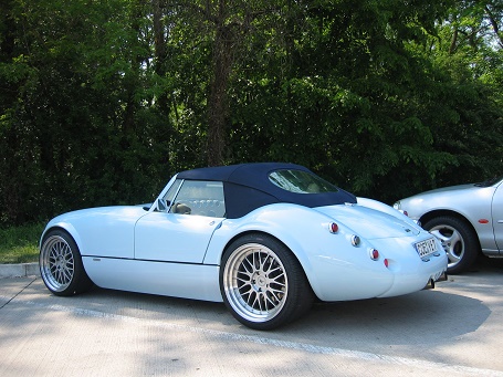
A car is a wheeled, self-powered motor vehicle used for transportation. Most definitions of the term specify that cars typically have four wheels.(Wikipedia)
Example (text before the picture)
<div class="w3-tooltip">
<p
class="w3-text">A car is a...</p>
<img src="img_car.jpg"
alt="Car">
</div>
Try It Yourself »
Example (text after the picture)
<div class="w3-tooltip">
<img src="img_car.jpg"
alt="Car">
<p
class="w3-text">A car is a...</p>
</div>
Try It Yourself »
Absolute Positioned Tooltip
If you want the tooltip to appear in an absolute position, position the tooltip text with CSS:
Example
<p class="w3-tooltip">London
<span style="position:absolute;left:0;bottom:18px"
class="w3-text w3-tag">9 million inhabitants</span>
is the capital of England.</p>
Try It Yourself »
Colored Tooltip
If you want a colored tooltip, use the w3-color classes:
Rounded Tooltip
If you want a rounded tooltip, use the w3-round classes:
Small Tooltip
If you want a small tooltip, use the w3-small class:
Tiny Tooltip
If you want a tiny tooltip, use the w3-tiny class:
Large Tooltip
If you want a large tooltip, use the w3-large classes:
Animated Tooltip
If you want to fade in the tooltip, use the w3-animate-opacity class:
Example
<span class="w3-text w3-tag w3-animate-opacity">9 million inhabitants</span>
Try It Yourself »
