Accessibility Heading Levels
Why
People use the heading structure to scan the page and get an understanding of the main content. This is true for both sighted users and screen reader users.
What
Headings are defined with the <h1> to <h6> tags. Users skim your pages by its headings.
It is important to use headings to show the document structure and the relationships between different sections. <h1> headings should be used for main headings, followed by <h2> headings, then the less important <h3>, and so on.
How
Let us check a good and a bad example of heading levels.
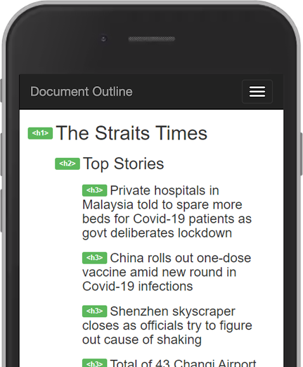
Good document outline: The Strait Times
- Download the browser extension Web Developer. It is available for Chrome, Firefox and Opera.
- Open The Straits Times.
- Open Web Developer. Under the tab Information, click View Document Outline.
- Scan through the document outline.

Now you have an understanding of how a document outline can be.
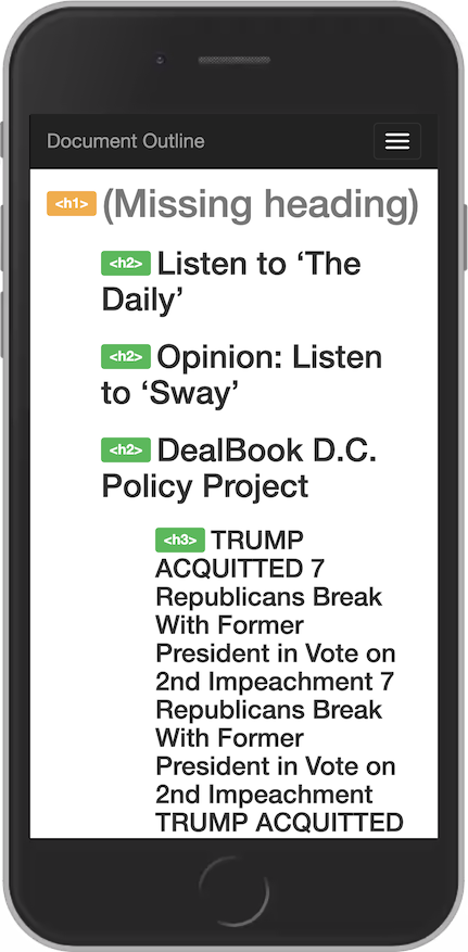
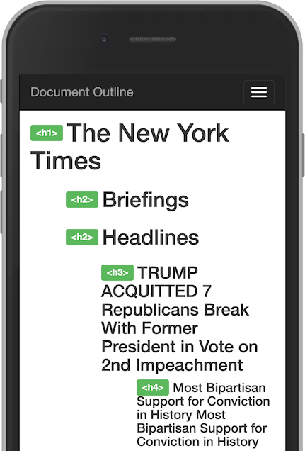
Bad document outline: The New York Times
- Open The New York Times.
- Open Web Developer. Under the tab Information, click View Document Outline.
- Scan through the document outline.

Problems
This document structure is confusing. It has many problems:
- No main heading
<h1>. - The first three
<h2>s are confusing without the visual context. - The
<h3>s are not related to the above<h2>about Trump is not related to the DealBook Policy Project. - The
<h3>has multiple headings combined. - The
<h3>is repeating information.
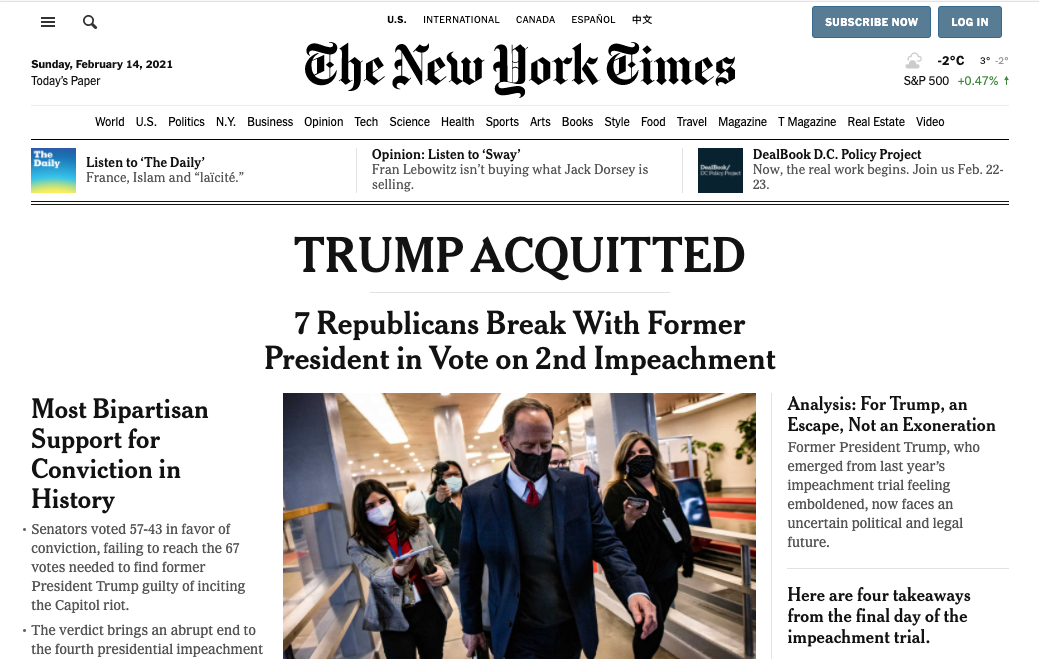
Take a look at the visual hierarchy.

The most prominent headline is Trump Acquitted. The next heading is 7 Republicans Break With Former President in Vote on 2nd Impeachment. Visually, the next three headings are clearly subheadings on the same level, even if Most Bipartisan … is larger than Analysis …
Solutions
Let us solve each problem, point by point.
No main heading
We have at least four alternatives to set the main heading:
- Use the logo as the main heading. The way The Straits Times did it.
- Use Trump Acquitted as the main heading.
- Use Trump Acquitted together with 7 Republicans Break With Former President in Vote on 2nd Impeachment as the main heading. Even though the two headings are distinct visually, they can be considered one heading from a semantic point of view. They both describe the content that follows.
- Add a hidden heading Front page.
Confusing h2s
These three headings is confusing without the visual context:
- Listen to 'The Daily'
- Opinion: Listen to 'Sway'
- DealBook D.C. Policy Project
We can solve this in at least two ways:
- Add a hidden heading.
- Change the level of the headings from h2 to h3.
- Change the headings to a list.
Sometimes it makes sense to add content just for screen readers. This is such a case. A common practise is to use a CSS class .sr-only, where sr means screen reader:
<h2 class="sr-only>Briefings</h2>
and add this styling to put it off screen:
CSS class .sr-only that is only accessible for screen readers:
.sr-only {
position: absolute;
left: -10000px;
top: auto;
width: 1px;
height: 1px;
overflow: hidden;
}
Then it makes sense to change the level of the briefings from h2 to h3. But are they really headings? Do they present the following content? Let's say no. If we agree on that, we can change the three links to a list.
The Trump <h3>
Both the prominent heading Trump Acquitted and the following heading 7 Republicans … points to the same article. Therefore, they can be a part of the same heading. Again, there is no right or wrong here. We can change this to a h2 or we can add a hidden heading for this <section>:
<h2 class="sr-only">Headlines</h2>
The heading Headlines works well together with Briefings in the document outline.
Repeating information
The heading 7 Republicans … is repeated twice. This is because a h3 is nested inside another h3. Let's remove it and head over to Web Developer to display our new document outline.

Way better.
In this page, you have read many headings. Check the document outline. Is it good?
