Responsive Web Design - Media Queries
What is a Media Query?
Media query is a CSS technique introduced in CSS3.
It uses the @media rule to include a block of CSS properties only if a
certain condition is true.
Example
If the browser window is 600px or smaller, the background color will be lightblue:
@media only screen and (max-width: 600px) {
body {
background-color: lightblue;
}
}
Try it Yourself »
Add a Breakpoint
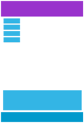
Earlier in this tutorial we made a web page with rows and columns, and it was responsive, but it did not look good on a small screen.
Media queries can help with that. We can add a breakpoint where certain parts of the design will behave differently on each side of the breakpoint.
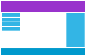
Desktop

Phone
Use a media query to add a breakpoint at 768px:
Example
When the screen (browser window) gets smaller than 768px, each column should have a width of 100%:
/* For desktop: */
.col-1 {width: 8.33%;}
.col-2 {width: 16.66%;}
.col-3 {width: 25%;}
.col-4 {width: 33.33%;}
.col-5 {width: 41.66%;}
.col-6 {width: 50%;}
.col-7 {width: 58.33%;}
.col-8 {width: 66.66%;}
.col-9 {width: 75%;}
.col-10 {width: 83.33%;}
.col-11 {width: 91.66%;}
.col-12 {width:
100%;}
@media only screen and (max-width: 768px) {
/* For mobile phones: */
[class*="col-"] {
width: 100%;
}
}
Try it Yourself »
Always Design for Mobile First
Mobile First means designing for mobile before designing for desktop or any other device (This will make the page display faster on smaller devices).
This means that we must make some changes in our CSS.
Instead of changing styles when the width gets smaller than 768px, we should change the design when the width gets larger than 768px. This will make our design Mobile First:
Example
/* For mobile phones: */
[class*="col-"] {
width: 100%;
}
@media only screen and (min-width:
768px) {
/* For desktop: */
.col-1 {width: 8.33%;}
.col-2 {width: 16.66%;}
.col-3 {width: 25%;}
.col-4 {width: 33.33%;}
.col-5 {width: 41.66%;}
.col-6 {width: 50%;}
.col-7 {width: 58.33%;}
.col-8 {width: 66.66%;}
.col-9 {width: 75%;}
.col-10 {width: 83.33%;}
.col-11 {width: 91.66%;}
.col-12 {width: 100%;}
}
Try it Yourself »
Another Breakpoint
You can add as many breakpoints as you like.
We will also insert a breakpoint between tablets and mobile phones.
Desktop
Tablet
Phone
We do this by adding one more media query (at 600px), and a set of new classes for devices larger than 600px (but smaller than 768px):
Example
Note that the two sets of classes are almost identical, the only
difference is the name (col- and col-s-):
/* For mobile phones: */
[class*="col-"] {
width: 100%;
}
@media only screen and (min-width: 600px) {
/* For tablets: */
.col-s-1 {width: 8.33%;}
.col-s-2 {width: 16.66%;}
.col-s-3 {width: 25%;}
.col-s-4 {width: 33.33%;}
.col-s-5 {width: 41.66%;}
.col-s-6 {width: 50%;}
.col-s-7 {width: 58.33%;}
.col-s-8 {width: 66.66%;}
.col-s-9 {width: 75%;}
.col-s-10 {width: 83.33%;}
.col-s-11 {width: 91.66%;}
.col-s-12 {width: 100%;}
}
@media only screen and (min-width:
768px) {
/* For desktop: */
.col-1 {width: 8.33%;}
.col-2 {width: 16.66%;}
.col-3 {width: 25%;}
.col-4 {width: 33.33%;}
.col-5 {width: 41.66%;}
.col-6 {width: 50%;}
.col-7 {width: 58.33%;}
.col-8 {width: 66.66%;}
.col-9 {width: 75%;}
.col-10 {width: 83.33%;}
.col-11 {width: 91.66%;}
.col-12 {width: 100%;}
}
It might seem odd that we have two sets of identical classes, but it gives us the opportunity in HTML, to decide what will happen with the columns at each breakpoint:
HTML Example
For desktop:
The first and the third section will both span 3 columns each. The middle section will span 6 columns.
For tablets:
The first section will span 3 columns, the second will span 9, and the third section will be displayed below the first two sections, and it will span 12 columns:
<div class="row">
<div class="col-3 col-s-3">...</div>
<div
class="col-6 col-s-9">...</div>
<div
class="col-3 col-s-12">...</div>
</div>
Try it Yourself »
Typical Device Breakpoints
There are tons of screens and devices with different heights and widths, so it is hard to create an exact breakpoint for each device. To keep things simple you could target five groups:
Example
/*
Extra small devices (phones, 600px and down) */
@media only screen and (max-width: 600px)
{...}
/* Small devices (portrait tablets and large phones, 600px and up)
*/
@media only screen and (min-width: 600px) {...}
/* Medium devices (landscape tablets, 768px and up) */
@media only screen and (min-width: 768px) {...}
/* Large devices (laptops/desktops, 992px and up)
*/
@media only screen and (min-width: 992px) {...}
/* Extra large devices (large
laptops and desktops,
1200px and up) */
@media only screen and (min-width: 1200px) {...}
Try it Yourself »
Orientation: Portrait / Landscape
Media queries can also be used to change layout of a page depending on the orientation of the browser.
You can have a set of CSS properties that will only apply when the browser window is wider than its height, a so called "Landscape" orientation:
Example
The web page will have a lightblue background if the orientation is in landscape mode:
@media only screen and (orientation:
landscape) {
body {
background-color: lightblue;
}
}
Try it Yourself »
Hide Elements With Media Queries
Another common use of media queries, is to hide elements on different screen sizes:
Example
/* If the screen size is 600px wide or less, hide the element */
@media
only screen and (max-width: 600px) {
div.example {
display: none;
}
}
Try it Yourself »
Change Font Size With Media Queries
You can also use media queries to change the font size of an element on different screen sizes:
Variable Font Size.
Example
/* If the screen size is 601px or
more, set the font-size of <div> to 80px */
@media only screen and (min-width:
601px) {
div.example {
font-size: 80px;
}
}
/* If the screen size is 600px or
less,
set the font-size of <div> to 30px */
@media only screen and (max-width: 600px) {
div.example {
font-size: 30px;
}
}
Try it Yourself »
CSS @media Reference
For a full overview of all the media types and features/expressions, please look at the @media rule in our CSS reference.
